

"Intuitive software, highly responsive team. Getting setup in and using [EnergyCAP SmartAnalytics] had a very short learning curve. The software is built with do-it-yourself functionality, which has...

Headquarters
EnergyCAP, LLC
360 Discovery Drive
Boalsburg, PA 16827
Denver, CO
Suite 500
5445 DTC Parkway
Greenwood Village, CO 80111
Dublin, Ireland
Unit F, The Digital Court, Rainsford Street,
Dublin 8, D08 R2YP, Ireland
Phone: 877.327.3702
Fax: 719.623.0577
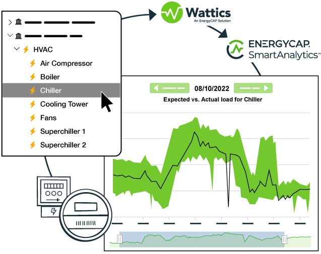

Wattics is now EnergyCAP SmartAnalytics! Turn raw data in to actionable insights to create high-performance, energy efficient, cost-effective, net-zero buildings.


Stop wasting time analyzing your data. Let our machine learning analytics engines compare your energy use against expected patterns and alert you when your consumption becomes abnormal. Save up to 90% of your time spent analyzing energy data.
Our easy-to-use energy management dashboard is the perfect tool for energy managers and business owners to make intelligent business decisions to identify energy wastage, save money, increase sustainability, and reduce carbon footprint.
Integrate a multitude of real-time data types, including electricity, gas, water, CO2, air quality, production, operational and other 3rd party sources such as degree days, BMS, and more. Whatever data you need, we’ve got you covered.
Maximize sustainability and savings! Purchase SmartAnalytics standalone, or bundle it with EnergyCAP’s best-in-class utility bill management and carbon accounting solutions for unparalleled value and efficiency. Contact sales for more information on bundle discounts.
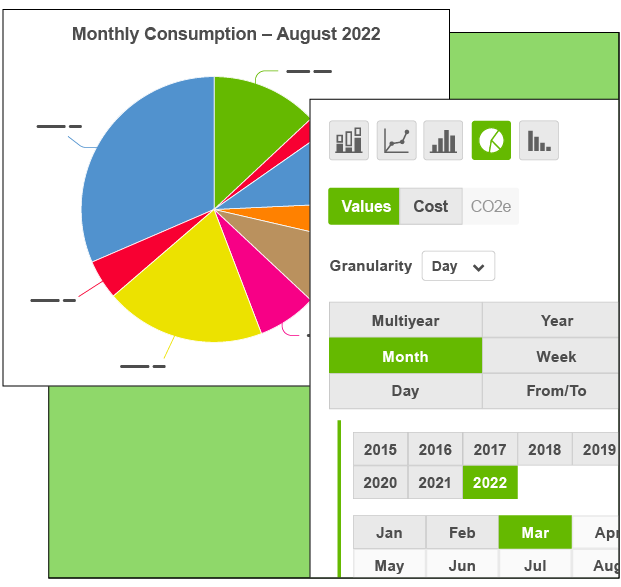
Explore our enterprise energy management platform for real-time monitoring across metrics, locations, and costs. From IPMVP validation to tariff analysis, our user-friendly dashboard empowers energy professionals with innovative features.
Connect to many supported devices and systems, including APIs, Gateways, Meters, Files, Sensors, Solar and PV, and Data Systems. Integrate a multitude of data types—electricity, gas, water, CO2, air quality, production, operational and other 3rd party sources such as degree days, BMS, and more.
Identify resource saving opportunities and optimize the operations in the commercial buildings or sites you manage. Collect, manage, analyze, and report on data to better manage your projects and achieve savings for your clients.
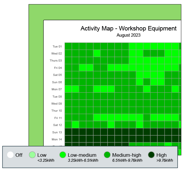
View live measurements of the consumption values of monitored areas/equipment in your facilities. Set performance thresholds and get automatic alerts and alarms to performance anomalies in real-time through email, SMS, and in-app. Quickly evaluate patterns of power consumption and when peak load demand happens. Calculate potential savings and model new consumption schedules.
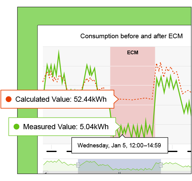
Access expanded measurement and verification options using time-series data, multi-variate regression, non-energy correlations, expanded project tracking, and compliance with ISO 50001. Monitor and analyze indoor air quality variables such as PM2.5, PM10, TVOC, CO2, humidity, temperature, and more.


For more than 40 years, the EnergyCAP mission has been to simplify energy and sustainability data management. Combining your strengths and ours, we'll partner to build a more sustainable world through responsible management of finite resources.
Accurate, timely, and dependable data is key to your success. Make manual data entry a thing of the past and let us do the work for you. We capture utility bill data in any format and also capture smart meter interval data from available sources.
Our team of industry experts are here to guide you through your data journey from expert implementation to advanced consultation, to becoming an extension of your team. We’re here to help you do your best work and achieve your goals.
Whether you are new to EnergyCAP or if you just need a refresher course, we are committed to helping you and your team maximize the value from the software. We offer online or in person customized training to meet your specific needs.